July 2026
Why Your Web App’s Progress Bar Triggers the Same Dopamine as a Near-Win
Discover how progress bars and loading spinners tap into the same dopamine-driven anticipation as a near-win, shaping user behavior
The line between a satisfying user experience and a compulsive loop is thinner than most developers care to admit. When you design a progress bar, a loading spinner, or a gamified onboarding sequence, you are not just coding for utility; you are architecting an emotional timeline. The question is not whether these micro-interactions engage the user—they do, demonstrably—but whether the specific pattern of anticipation and relief they create mirrors the same neural circuitry triggered by a near-win scenario in high-stakes environments. For Croatian product teams building for local audiences, understanding this overlap is not an academic curiosity; it is a practical necessity for ethical design.
The Architecture of Anticipation: Variable-Ratio Reinforcement in UI
The most powerful behavioral lever in web design is not a flashy animation or a clever copy line. It is the schedule of reward. In behavioral psychology, the variable-ratio reinforcement schedule is the gold standard for habit formation. This is the principle that made B.F. Skinner’s pigeons peck at a disc thousands of times for an unpredictable pellet. It is also the reason slot machines are engineered not to pay out every time, but to pay out almost every time—specifically, at a ratio that keeps the player in a state of suspended expectation.
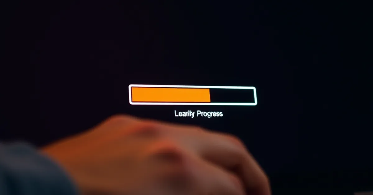
Your web app’s progress bar operates on a similar, albeit more benign, variable schedule. Consider a file upload indicator. It does not move at a constant speed. It lurches forward quickly at first, then slows down, then jumps again. This is not a technical limitation; it is a deliberate design choice. When the bar pauses at 97% for what feels like an eternity, the user experiences a specific kind of tension. They are not merely waiting; they are anticipating completion. That final jump from 97% to 100% is a reward that feels earned, even though the user did nothing to earn it.
The Near-Win Parallel: In gambling research, a "near miss" is a loss that appears to be a win. A slot reel stopping one position short of the jackpot. A scratch card revealing two matching symbols out of three. These events are not wins—they are losses—but they activate the brain’s reward system almost as strongly as an actual win. The dopamine release is not about the outcome; it is about the prediction error. The brain says, "I almost got it. Try again."
Your progress bar does not need to reach 100% to trigger this. A loading screen that hovers at 99% for three seconds, then completes, creates a tiny prediction error. The user's brain registers the relief of completion more vividly because it was preceded by a moment of doubt. This is not manipulation; it is the fundamental way human motivation works. The problem arises when designers exploit this without understanding the cost.
The Croatian Context: Patience and Trust
Croatian users are not uniquely susceptible to these patterns, but they bring a specific cultural lens. In a market where digital services have historically been uneven—slow internet in coastal areas during summer, bureaucratic delays in government portals—users have developed a high tolerance for waiting, but a low tolerance for deceptive waiting. A progress bar that lies (e.g., claiming to be at 50% when the backend has not even started processing) will erode trust faster than a slower but honest bar. The near-win effect works only when the user perceives the system as fair. Once they suspect the bar is a theatrical prop, the dopamine effect inverts into frustration.
Loss Aversion and the Anxiety of the Incomplete Form
Kahneman and Tversky’s prospect theory teaches us that losses hurt roughly twice as much as equivalent gains feel good. This asymmetry is not limited to money. It applies to time, effort, and progress. In web development, this manifests most clearly in multi-step forms and onboarding flows.
Consider a registration wizard with four steps. The user completes step one, sees a satisfying checkmark. Step two, another checkmark. Step three is a long, complex form field. The user hesitates. They are halfway through step three when they consider abandoning the process. At this point, the sunk cost is not financial—it is psychological. They have invested time, cognitive effort, and emotional energy. The progress bar at the top of the page shows 50% completion. This is a loss-aversion trap.
The Near-Win Twist: If the progress bar shows 75% when the user is halfway through step three, the system is lying. But if it shows 50%, it is honest. However, the designer can manipulate the perception of near-completion. A progress bar that jumps from 50% to 75% after a single easy action (e.g., clicking "Next" on a trivial field) creates a near-win sensation: "I am closer than I thought." The user feels a surge of momentum. They are more likely to complete the form.
This is the ethical boundary. Using loss aversion to prevent abandonment is standard UX practice. Exploiting the near-win effect to trick a user into continuing a process they would otherwise abandon is a gray area. In Croatia, where regulatory scrutiny on digital products is increasing (GDPR enforcement, consumer protection laws), designers must be transparent about what the progress bar represents. Is it progress through the form, or progress toward value? The two are rarely the same.
A Concrete Example: The LinkedIn Profile Strength Meter
LinkedIn’s profile strength meter is a textbook case of near-win mechanics in a non-gambling context. The meter shows a percentage (e.g., "Intermediate" at 50%). The user adds a skill, and the meter jumps to 55%. They add a photo, and it jumps to 65%. The increments are not linear. Adding a photo is a one-time action, but the meter treats it as a major milestone.
The near-win occurs at the 95% mark. The user is "All-Star" but not yet "Strong." They are missing one tiny piece of data—perhaps a job description that is too long. The brain interprets this as: "I am so close. One more action will complete it." This drives engagement.
But there is a catch. LinkedIn’s meter is not measuring your career success; it is measuring how much data LinkedIn can sell to recruiters. The user is chasing a near-win that serves the platform’s business model, not their own goals. For Croatian startups building similar gamified onboarding, the question becomes: whose near-win is this? If the user’s goal is to connect with local businesses, and the progress bar guides them toward that goal, the dopamine is aligned. If the bar guides them toward data entry with no clear benefit, the user will eventually feel manipulated—and they will leave.
The Dopamine Cycle of Real-Time Feedback
Real-time feedback loops are the most potent tools in a web developer’s arsenal. Live search suggestions, typing indicators in chat apps, and dynamic form validation all create micro-rewards. Each keystroke produces an immediate response. This is the opposite of the near-win; it is the constant win.
But even constant wins can decay into boredom. The brain habituates. The solution is to introduce intermittent feedback—a pattern that mimics the variable-ratio schedule.
The Notification Badge: Consider the red notification badge on a social media app. It is a progress bar of social engagement. Zero notifications is a blank slate. One notification is a small win. Ten notifications is a flood. The user clears them, and the badge disappears. Then, unpredictably, a new notification appears. This is a near-win in reverse: the user is not close to a goal; they are receiving a goal. The brain interprets the new notification as a potential reward.
In web development, this translates to features like "X people are viewing this item" on an e-commerce site. The number fluctuates. It is not real-time data (usually, it is cached or simulated), but it creates the illusion of urgency and social proof. The user’s brain treats this as a near-win: "I am close to a purchase opportunity. I must act now."
The Croatian E-Commerce Case
A Croatian online marketplace for handmade crafts implemented a real-time visitor counter. The counter showed "23 people are viewing this item." Users reported feeling a sense of competition. They were more likely to add the item to cart. But the counter was static—it always showed a number between 20 and 30, regardless of actual traffic. When users discovered this (through a Reddit thread in /r/croatia), trust plummeted.
The lesson is not to avoid real-time feedback; it is to ensure the feedback is truthful and actionable. If you show a progress bar for a download, let it reflect actual bytes transferred. If you show a visitor counter, use real analytics. The dopamine hit from a genuine near-win (e.g., "Only 3 items left in stock") is more sustainable than a fabricated one.
Practical, Forward-Looking Close
The overlap between web design and behavioral psychology is not going away. If anything, the next generation of interface tools—AI-driven personalization, adaptive UIs, biometric feedback—will make these patterns more sophisticated. The challenge for Croatian developers is not to avoid these tools, but to wield them with intention.
Start by auditing your existing progress bars, loading screens, and gamified elements. Ask three questions:
- Is the metric honest? Does the progress bar measure what it claims to measure, or is it designed to keep the user engaged at the cost of transparency?
- Is the near-win aligned with user value? Does the dopamine spike lead the user toward a goal they genuinely want, or toward a metric that benefits your business?
- Is the variable schedule ethical? Are you introducing unpredictability to help users overcome friction (e.g., a complex form), or to hook them into compulsive behavior (e.g., infinite scrolling)?
The most durable web apps in Croatia will be those that treat the user’s dopamine system with respect. Not as a resource to be mined, but as a signal to be honored. When your progress bar triggers a near-win, it should be because the user is close to something valuable—not because you designed a slot machine for their attention. Build for the long game. The short-term dopamine spike is not worth the long-term loss of trust.