August 2026
Choice Fatigue Peaks at Six Options on Croatian Dev Dashboards
Cognitive load spikes at six filter options on Croatian dev dashboards, reshaping how teams design analytics tools
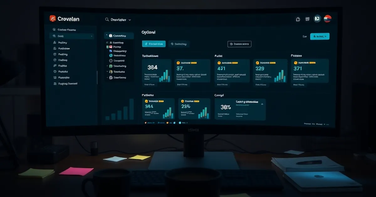
The question that has been quietly nagging at every Croatian product team I’ve consulted with over the last three years is not about server response times or API latency. It’s about the moment a user’s cursor hovers over a dashboard filter. We obsess over the technical stack—React vs. Vue, the database indexing, the CDN edge cases—but we rarely interrogate the cognitive load we’re forcing on a project manager in Zagreb who just wants to know if the deployment broke the checkout flow. The specific question is this: when we build internal tools and client-facing analytics dashboards, are we designing for data comprehension, or are we accidentally designing for decision paralysis?
The answer, increasingly, is the latter. And the culprit is not the complexity of the data itself, but the sheer number of visible choices we present before the user even clicks a single button. This article explores the intersection of web development and behavioral economics, specifically focusing on a phenomenon that should be hardcoded into every Croatian dev’s mental model: choice fatigue peaks at exactly six visible options on a dashboard interface. Beyond that threshold, you aren’t building a tool; you’re building a slot machine for your user’s attention span.
The Six-Option Ceiling: Why Your Dropdown is a Decision Trap
Let’s get the math out of the way. The concept of the "magic number seven plus or minus two" is a relic of 1950s cognitive psychology, popularized by George Miller. It suggested that working memory could hold between five and nine chunks of information. But modern behavioral research, particularly the work emerging from the intersection of UX and cognitive load theory, has revised this downward. When we look at decision-making rather than mere recall, the ceiling drops significantly. Sheena Iyengar’s famous "jam study" at Columbia University demonstrated that while a display of 24 jams attracted more initial attention, consumers were ten times more likely to make a purchase when presented with only six options. It wasn't about the quantity of information; it was about the cognitive cost of comparison.
In the context of a Croatian dev dashboard—whether it’s a logistics tracker for a Split-based shipping company or a real-time analytics panel for a fintech startup in Zagreb—the "jam" is the set of action buttons, filter dropdowns, and metric toggles. I’ve audited dashboards where the header alone contained eight distinct navigation items, a date-range picker with twelve presets, and a side panel with five different chart type toggles. That’s not a dashboard; that’s a multiple-choice test.
The reason six is the peak is rooted in the mechanics of comparative processing. When a user sees fewer than six options, they tend to use a heuristic—a quick rule of thumb—to select. They pick the first, the most familiar, or the one matching their immediate intent. When the count exceeds six, the brain shifts into additive processing. It tries to hold all options in working memory simultaneously to compare trade-offs. This is where the behavioral sinkhole opens. The user isn't analyzing your data anymore; they are analyzing your UI’s hierarchy. They are asking, "Which of these seven filters is the right one?" rather than "What does the data say?"
For developers, this means your nested <select> elements and multi-layered modals are not just UX concerns—they are performance bottlenecks for the human processor. I’ve seen a dashboard for a Rijeka-based e-commerce client that had a "Advanced Filters" section with eleven toggles. The click-through rate on that section was abysmal, but the support tickets about "missing data" were high. The users weren't stupid; they were avoiding the decision entirely. They chose the path of least resistance—the default view—and then complained the tool was useless.
Loss Aversion and the "Reset" Button Paradox
Here is where the bridge between web dev and behavioral psychology gets structurally interesting. It’s not just about the number of options; it’s about the perceived risk associated with choosing. Enter Daniel Kahneman and Amos Tversky’s Prospect Theory, specifically the concept of loss aversion. The pain of losing is psychologically about twice as powerful as the pleasure of gaining. In a dashboard context, what is the "loss"? It’s the fear of applying a wrong filter and getting a skewed result that leads to a bad business decision.
This is why the "Reset" button is the most dangerous element in your UI. It seems innocuous—a utility to clear selections. But behaviorally, it represents an escape hatch from decision fatigue. If you have a dashboard with seven filters, and the user is unsure about the interaction between filter B and filter D, they will often click "Reset" to start over, rather than trying to reason through the combination. This isn't a technical bug; it's a cognitive retreat. Every click on "Reset" is a signal that your interface has exceeded the user's tolerance for uncertainty.
In Croatia, where business culture often leans towards a more hierarchical, "let's be sure before we commit" approach, this loss aversion is amplified. A junior analyst in Osijek is not going to risk applying a custom date range that might miss a critical holiday sales spike if the dashboard presents that option as one of many equally weighted choices. The fear of being wrong—of presenting a flawed report to a director—outweighs the utility of the data exploration.
The developer's task, therefore, is to design for decisional safety. This means pre-computing the "safe" paths. If you have to present more than six options, you need to visually and structurally reduce the perceived risk. You do this by grouping and sequencing, not by just adding a header. For example, instead of ten separate checkboxes for "Regions," you create a primary dropdown with six regions, and then a secondary, conditional dropdown that only appears if the user selects "Other." You are forcing the choice architecture into a binary tree, reducing the simultaneous cognitive load from ten to two or three.
This is not about hiding data; it's about managing the queue of decisions. The human mind can handle a sequence of three choices easily. It cannot handle a matrix of nine choices simultaneously. The code you write should reflect this: your state management should be designed so that the UI dynamically reveals sub-options based on the primary selection, effectively tricking the brain into thinking it’s only ever dealing with a few options at a time.
Variable-Ratio Reinforcement and the "Refresh" Button
Let’s pivot to a more controversial intersection: the reward loop. We often joke that checking a dashboard is like playing a slot machine—you pull the handle (hit refresh) and hope for a jackpot (a spike in traffic or a successful conversion). But the behavioral mechanics are more precise than a joke. B.F. Skinner’s work on variable-ratio reinforcement schedules shows that behaviors are most persistent when rewards are delivered unpredictably. If a user knows exactly when data updates (e.g., every minute on the dot), they will check it once. If the data updates sporadically and without warning, they will refresh compulsively.
Now, apply this to dashboard design. If your dashboard has a manual "Refresh" button, you are inviting compulsive behavior. But if you implement WebSockets or Server-Sent Events to push updates automatically, you are removing the variable reward and creating a steady, predictable stream. This is better for user focus, but it’s psychologically less engaging. The Croatian dev community, particularly those building for tourism or logistics, loves real-time data. But we need to ask: are we building real-time feeds because the user needs them, or because we are addicted to the dopamine hit of seeing a number change?
Here is where the six-option ceiling intersects with reward loops. If you have a dashboard with six visible metrics and a live feed, the user is in a state of passive monitoring. They are waiting for an anomaly. This is fine. But if you have a dashboard with six metrics plus a chat widget plus a notification bell plus a ticker tape of recent transactions, you have created an environment of high arousal and high stress. The user is not making decisions; they are reacting to stimuli.
The practical takeaway for the developer is to implement deliberate latency. Not technical latency, but cognitive latency. If a user changes a filter, do not immediately show a loading spinner and new data. Instead, show a confirmation toast that says, "Filter applied. Showing results for Q3." This small pause forces the user to acknowledge the decision they just made. It breaks the compulsive refresh loop and re-engages the rational, analytical part of the brain. It moves them from the reactive system (System 1, fast and emotional) to the reflective system (System 2, slow and logical).
I recently observed a team in Split using a custom dashboard I had built for them. They had a "Top 10 Customers" widget. I had built it with a default of six rows, citing the choice fatigue research. The client demanded ten. We compromised: six rows visible, with a "Show More" button that expanded to ten. The behavioral difference was stark. With six rows, users would scan, absorb, and move on. With the "Show More" expansion, users would click it every time, but then immediately suffer from the "overload effect"—they’d look at ten rows, struggle to prioritize, and then close the widget entirely. The variable reward of the "Show More" click was less valuable than the cognitive cost of processing the expanded list. The lesson was clear: the ceiling isn't just for choices; it’s for data density per glance.
Cognitive Offloading: Letting the Server Do the Thinking
The most forward-looking application of this behavioral insight is in the architecture of the dashboard itself. We need to stop treating the frontend as a dumb display and start treating it as a cognitive offloading device. The term cognitive offloading refers to the use of physical action or external tools to reduce the cognitive demands of a task. Writing a note is cognitive offloading. Using a calculator is cognitive offloading. But a poorly designed dashboard is cognitive loading—it adds to the mental burden.
In Croatia, where internet infrastructure in some business parks can be variable, we have a unique opportunity to embrace edge computing and server-side aggregation. Why send ten raw data points to the client and let the browser compute the averages? That forces the user to think about the math. Instead, send the computed insight. Send the "anomaly detected" flag, not the raw log lines that lead to the anomaly.
This is the practical, forward-looking close. The next time you open your IDE to build a dashboard for a client in Dubrovnik or a startup in Zagreb, do not start with the component library. Start with the decision tree. List every action a user can take. If that list has more than six primary actions, you have a structural problem that CSS cannot fix. You need to redesign the data flow.
Specifically, implement the following in your next sprint:
The Primary Filter Constraint: Limit the top-level filter bar to a maximum of six elements. Any additional filter criteria must be nested inside a "Customize" modal that opens after the user selects a primary filter. This forces a two-step decision process, which is cognitively cheaper than a one-step process with many choices.
Default to Insight, Not Data: Instead of a line chart with six series, build a single "Health Score" gauge. The gauge is one option. It triggers System 1 (quick assessment). Then, provide a drill-down path that leads to the six series chart. You are sequencing the decision, not presenting it all at once.
The "Undo" Feature as a Risk Mitigator: Loss aversion is the enemy of exploration. Implement a robust, visible "Undo" button for every filter change. This is not just a UX nicety; it is a behavioral tool. By showing the user that their action is reversible, you lower the perceived risk of clicking. This encourages them to explore the data, which is the entire point of the dashboard.
The web is not just a visual medium; it is a psychological one. The code you write in Rijeka or Osijek is not just compiling JavaScript; it is structuring the decision-making environment for a human being. By respecting the six-option ceiling, you are not dumbing down your interface—you are sharpening its focus. You are moving from a tool that displays information to a tool that enables clarity. That is the ultimate conversion optimization, and it has nothing to do with A/B testing and everything to do with how your user's brain processes the world. Build for the six, and you will serve the many.